Zeal is an AI-powered restaurant discovery platform that helps users find dining spots tailored to their preferences and context—whether it’s mood, occasion, or group dynamics. As the sole product designer, I led the design of both the web and mobile experience. It’s been an incredibly hands-on role where I’ve gained deep insight into building products at a fast-paced startup, working cross-functionally, and constantly flexing my problem-solving muscle as new challenges came up!
Zeal AI
Founding Product Designer | San Francisco, 2024 – Present
The What
Zeal is an AI-powered restaurant discovery platform that helps users find the right place to eat based on mood, context, and group dynamics. As the only product designer, I was responsible for shaping the entire product experience across web and mobile—from the first sketch to the final shipped UI.
The Why
Eating out is rarely just about food—it’s about people, occasions, vibes. Most discovery platforms are built around static filters and generic ratings. Zeal set out to change that by creating a more intuitive, personalized way to explore dining options—one that feels more like a friend’s recommendation than a search engine result.
The How
Starting with user research and informal usability testing to understand real behaviors and pain points. Collaborated closely with engineering, and used analytics to continuously refine the product. In parallel, I created marketing assets like landing pages, social visuals, and pitch decks to support product launches and investor outreach. These efforts helped drive a 6.5x increase in weekly visitors and nearly a 10x lift in daily active users in just a few months
Tackling Early Drop-Off:
Helping Users Understand & Engage with Zeal
In the early days of Zeal, we noticed a high bounce rate on our homepage and landing flows. Using a combination of session playback analysis, informal user interviews, and product analytics, we uncovered that:
- Many users landed on the homepage but left without starting a query.
- The product value wasn’t immediately clear — users didn’t understand what Zeal could help them do.
- There was no clear “first step” or call to action to guide their exploration. This signaled a disconnect between our product intent and how users were experiencing the entry point.
Bounce rate January
90%
Problem statement
New users struggled to understand the product and needed clearer guidance to take their first action.
MVP
Solution
✨How might we help new users quickly understand what Zeal does and give them the right nudge to start their first query?
1.
Visual Redesign
Before users even read copy or interact with buttons, they form a quick impression based on visual design. Our original homepage lacked visual hierarchy and clarity around the core purpose. Users were overwhelmed by dense layouts, unclear CTAs, and competing content areas.
2.
Clearer Guidance
Even with a cleaner interface, users still need direction—especially in a product that blends discovery and AI-driven requests. We identified a major drop-off point: users simply didn’t know what to do next.
3.
Motivation to Explore
Once users understood how to get started, the next challenge was motivating them to actually want to do so. We learned through informal user interviews and analytics that people often needed inspiration—they wanted to explore, compare, and see what others were booking.
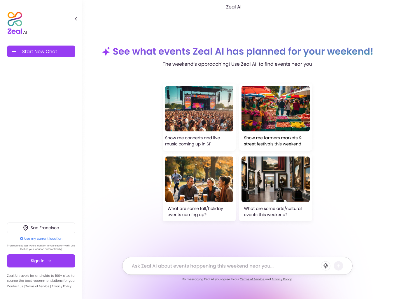
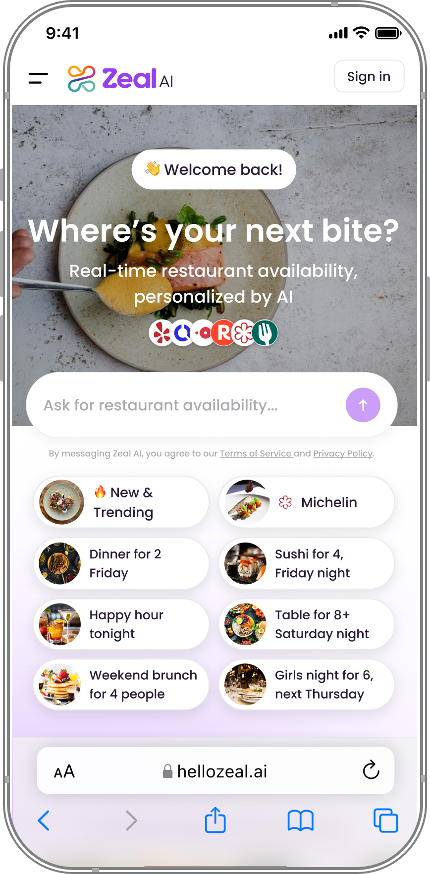
1. Visual Redesign of the Homepage
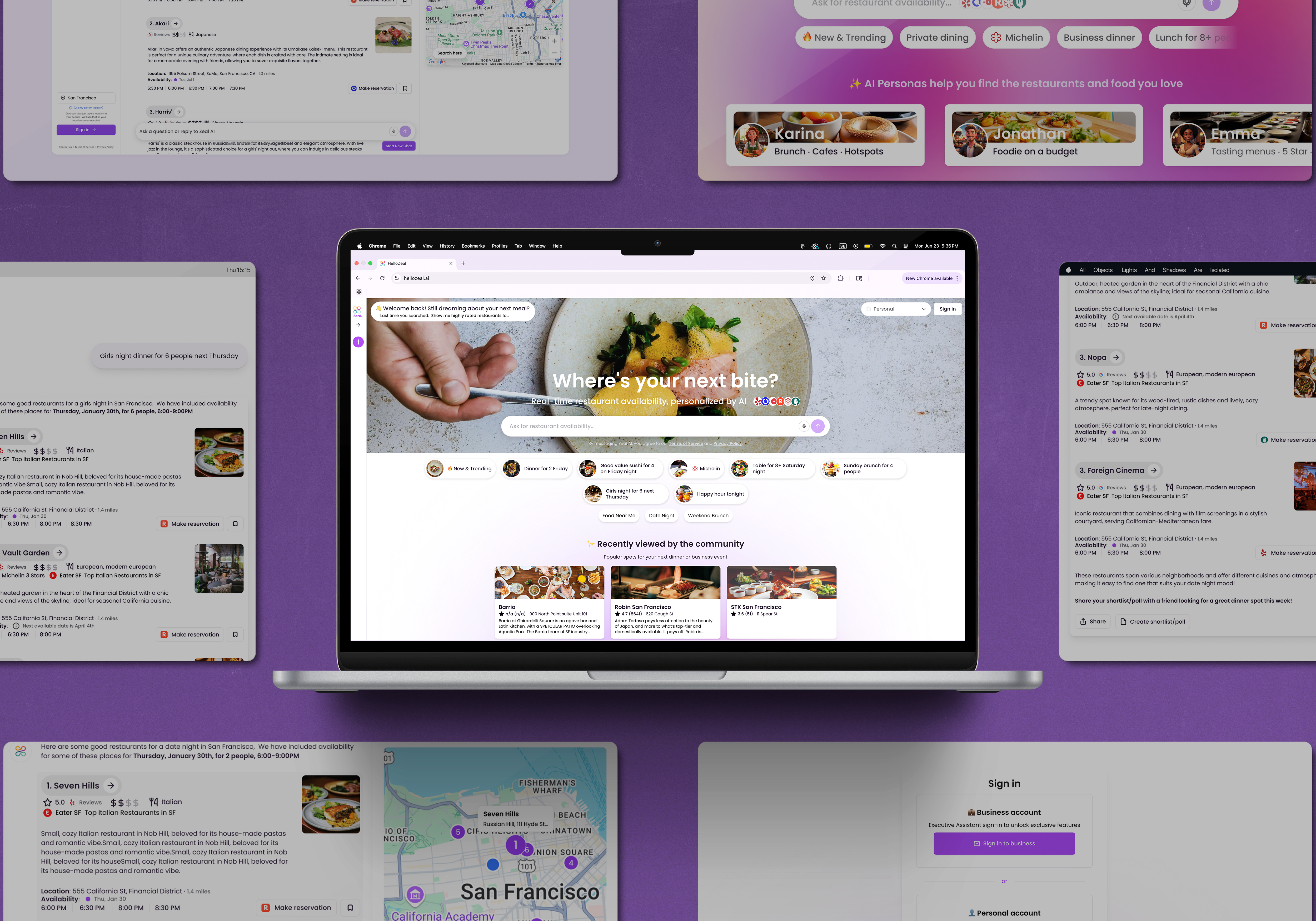
We fully restructured the homepage to shift away from the older “event and activity” focus and instead position Zeal as a restaurant discovery platform. Implementing a full redesign grounded in common UX principles like proximity, contrast, and progressive disclosure to reduce cognitive load. The new layout introduces clear visual hierarchy, separating primary actions, like starting a query, from secondary content. We emphasized whitespace, clarified typography, and used purposeful UI components to help users intuitively scan and engage. This redesign helped improve comprehension, reducing friction, and inviting for a new query.
The new design emphasized:
A hero search bar for queries
Bold, immersive visuals of dining spaces
Cleaner UI hierarchy to clarify what users could do next
This reframe aligned the UI with our real value proposition and gave users the push they needed to dive in.

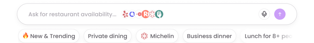
2. Example Prompts
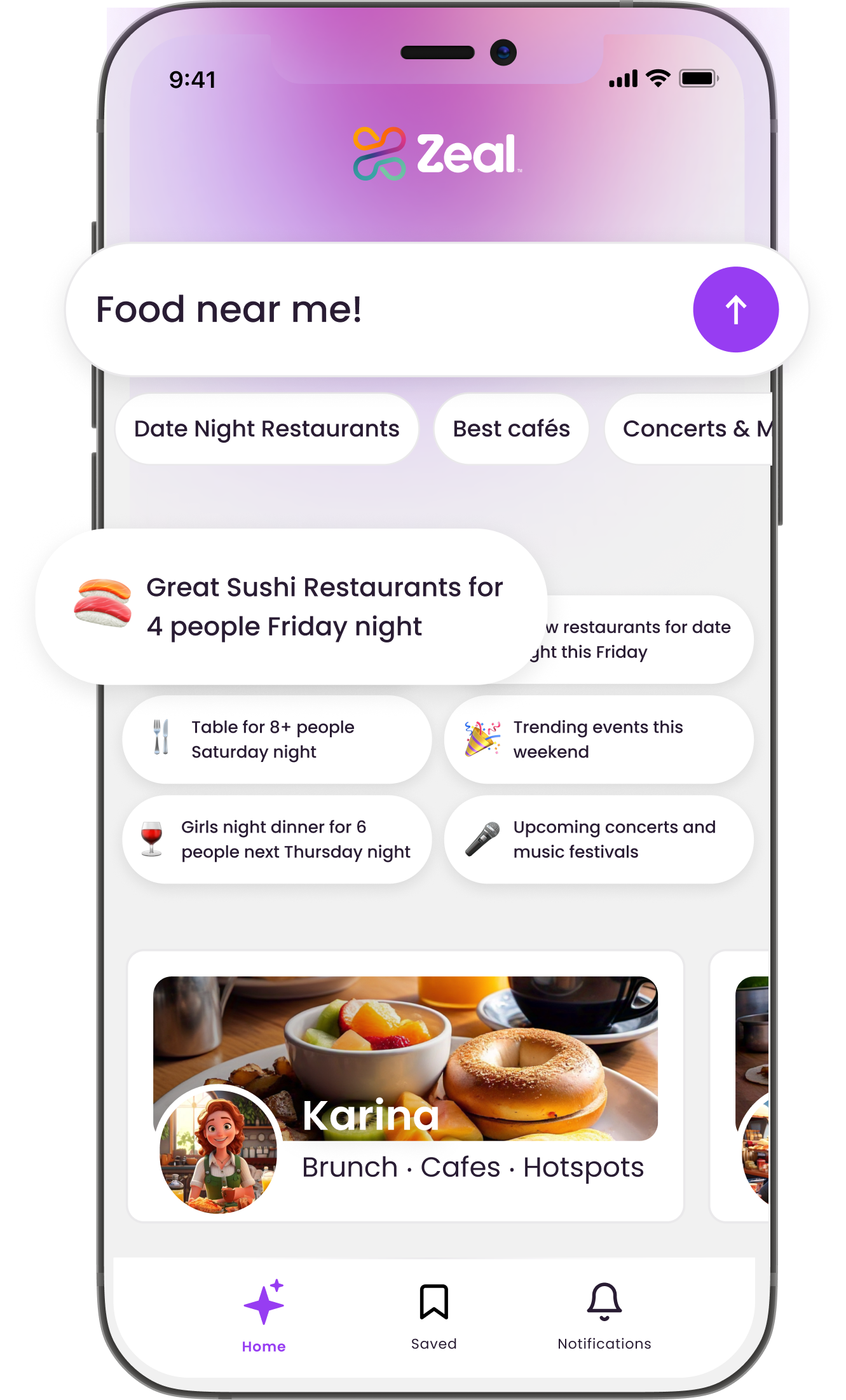
The redesign also focused on guiding users into action with less friction and more inspiration. This included revised placeholder text in the search bar, inline microcopy nudging users toward starting their first query, and example prompts that helped frame the agent’s capabilities. These small but thoughtful nudges gave users a sense of confidence and purpose, minimizing cognitive load and helping them take the first step. We added smart, pre-filled prompts to the search interface like:
“Find New and Trending restaurants for 2 tonight” or “Find me a reservation for 8+ people on Saturday night.”
These provided contextual starting points and modeled how to interact with the product. The prompts were instrumental in lowering the barrier to engagement by showing—not just telling—what was possible.
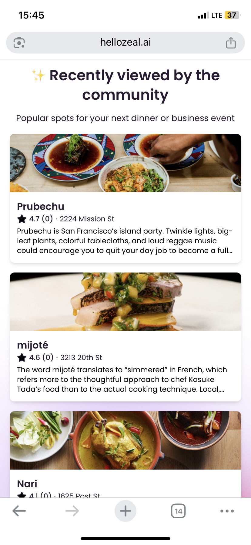
3. Recently Viewed Section
A new section highlighting the most-clicked and highly rated restaurants added to the homepage. This served as:
Social proof
A spark for curiosity
A subtle way to say, “Here’s what others are discovering — want to explore too?”
We needed a motivation from users to come back to the site and to explore new spots! To meet this need, we introduced a “Recently viewed by the community” section, showcasing popular and most-clicked options across our platform. This acted as social proof and gave users entry points based on real user behavior.
Outcomes & Impact
The redesign and strategic improvements had a measurable and lasting impact on user behavior and platform performance. By guiding new users with clearer prompts, showcasing popular content, and aligning the visual language with our restaurant discovery focus, we significantly reduced confusion and friction in the early user journey.
As a result:
User engagement increased significantly, with users staying longer and exploring more.
We saw a 9.3x growth in weekly visitor traffic.
Daily active users increased 13.5x, reflecting both improved onboarding and repeat engagement.
Overall, the changes drove substantial increases in traffic and activity, thanks to the more intuitive and purposeful UX flows and interface.
These results validated the design direction and proved that clarity, guidance, and visual consistency are critical in turning first-time visitors into active users.
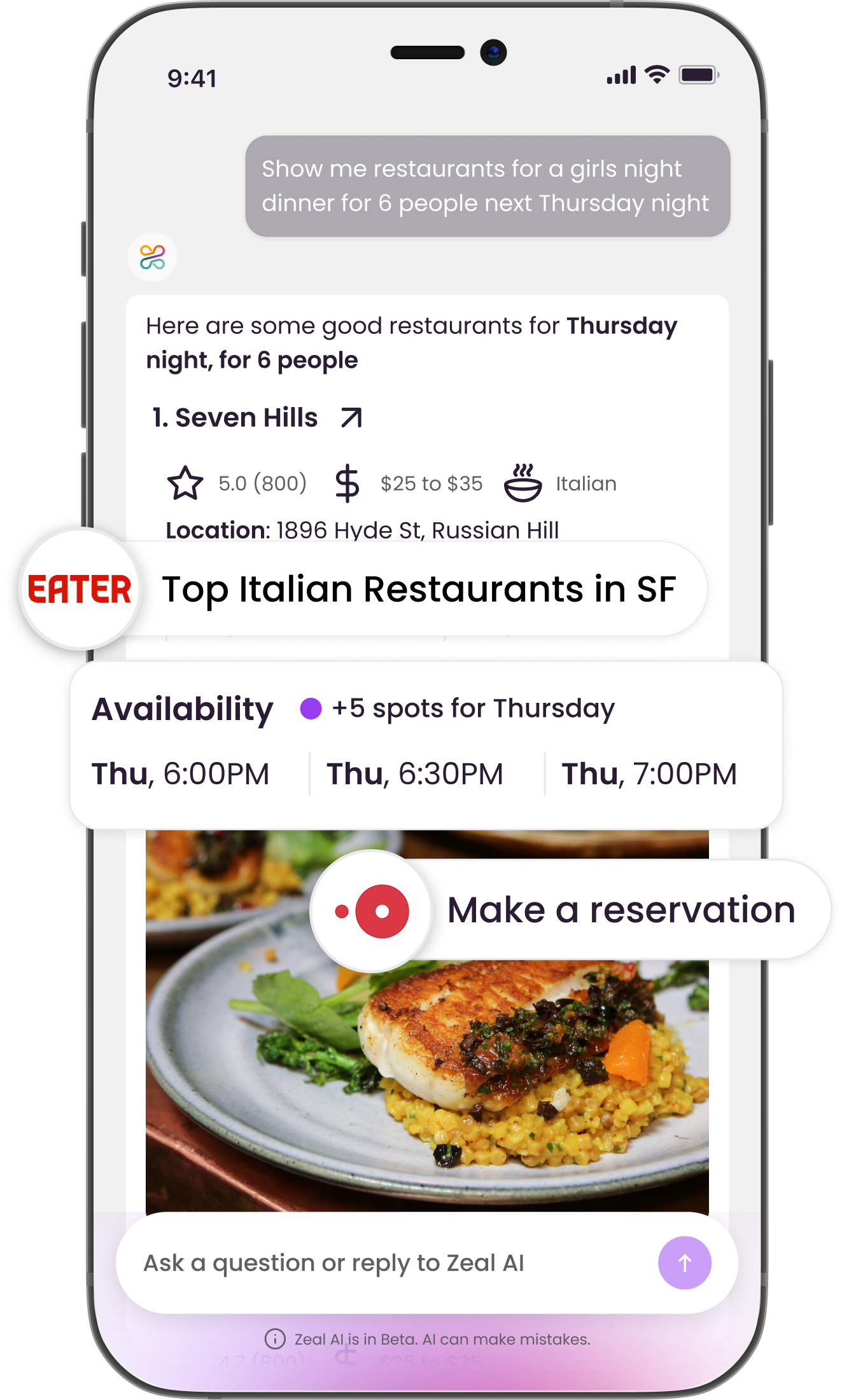
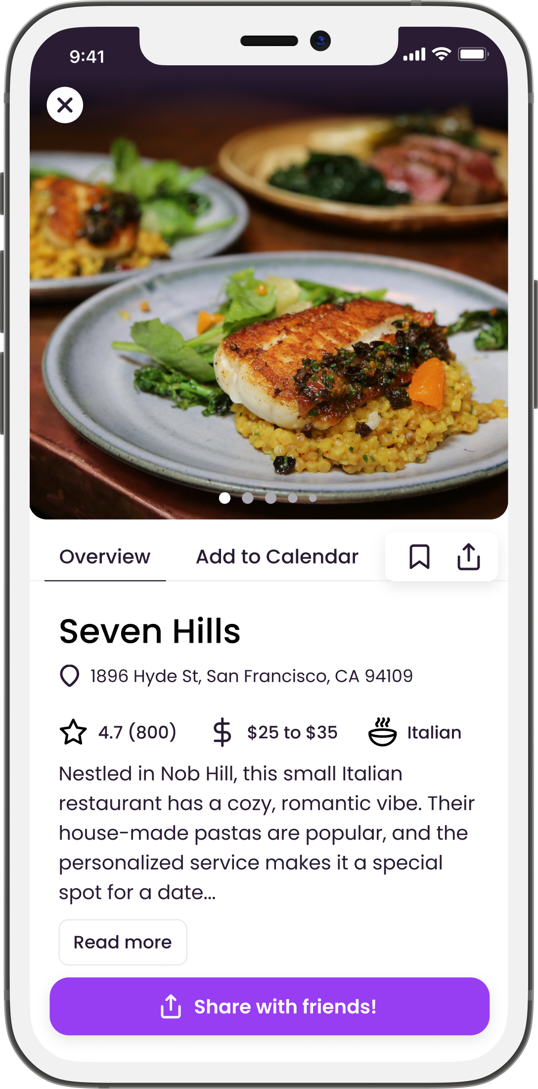
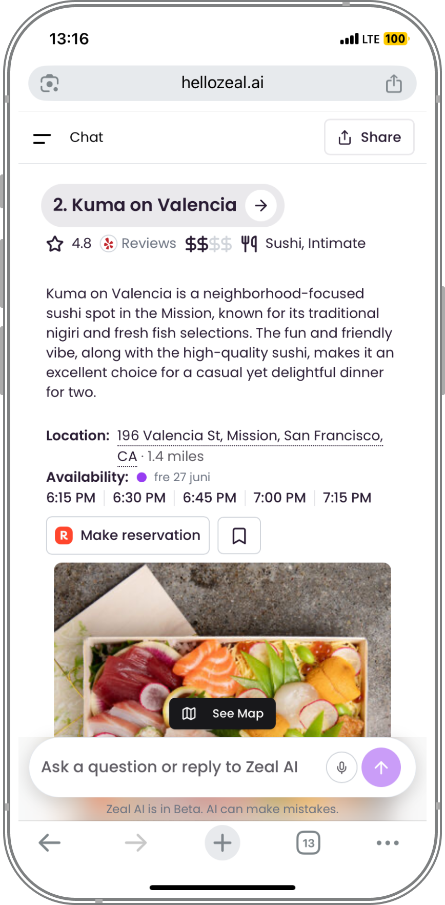
Organizing information
The results view had to present a lot of information without overwhelming the user—things like cuisine, location, vibe, booking options, and more. Getting the structure right was key. We focused on reducing cognitive load by showing only what’s most relevant up front, and grouping the rest in a way that’s easy to scan and compare.
Clear visual hierarchy, consistent spacing, and smart content grouping helped users absorb information quickly and move toward a decision without hesitation. The goal was always to make the interface feel light—even when the information wasn’t.

The Result & Learning
Working at Zeal was fast, challenging, and incredibly rewarding. As the only designer at a growing startup, I had full ownership of the product experience and wore many hats—from UX research to UI design, marketing, and even investor-facing materials. It pushed me to be resourceful, proactive, and highly organized—skills I now consider core to who I am as a designer.
One of the biggest takeaways from my time at Zeal is the importance of taking initiative. With limited structure, I learned to ask the right questions, lead with clarity, and move projects forward even when things were ambiguous. I also became more flexible—adapting quickly to shifting priorities and collaborating closely with cross-functional teams to get things shipped.
This experience didn’t just sharpen my technical skills; it shaped my work ethic. I care deeply about the details, but I’m also focused on outcomes. I’ve learned how to balance craft with speed, and how to communicate clearly so ideas can move fast without losing direction. Zeal gave me the space to grow, and I leave this chapter more confident, capable, and excited to take on new challenges.